
Art communicates before we even realize we’re listening. A single brushstroke can convey emotion, a carefully chosen color palette can evoke memories, and the arrangement of shapes on a canvas can tell entire stories without using a single word.
The Elements of Visual Language
Visual communication relies on fundamental building blocks that artists manipulate to create meaning. These elements work together like vocabulary in a spoken language, each contributing specific qualities to the overall message.
Line: The Foundation of Expression
Lines do more than define boundaries—they carry emotional weight and guide our eyes through compositions. Sharp, angular lines often suggest tension or conflict, while flowing curves evoke calmness and organic movement. The quality of a line reveals the artist’s intent: confident strokes communicate certainty, while hesitant marks might express vulnerability or contemplation.
Artists use line weight strategically to create hierarchy and emphasis. Thick lines demand attention and suggest strength, while delicate lines whisper rather than shout. The direction of lines also matters—vertical lines feel stable and dignified, horizontal lines suggest tranquility, and diagonal lines create dynamic energy.
Shape and Form: Building Visual Structure
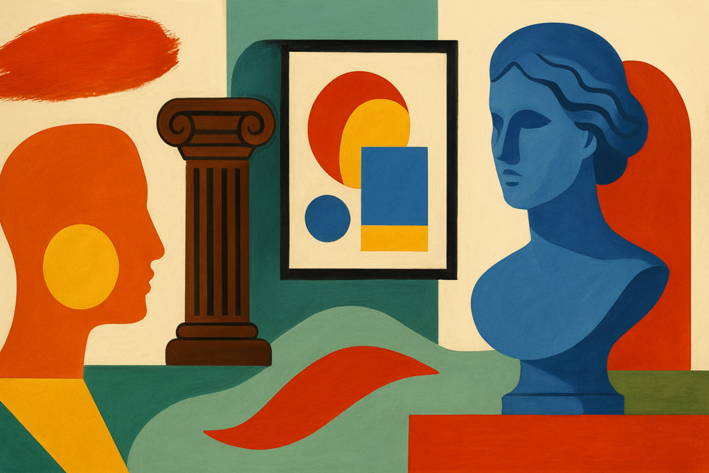
Shapes serve as the primary vocabulary of visual communication. Geometric shapes—circles, squares, triangles—carry cultural and psychological associations. Circles suggest completeness and unity, squares imply stability and order, while triangles create movement and point toward specific areas of focus.
Organic shapes, inspired by nature, communicate differently than their geometric counterparts. They feel familiar and comfortable, connecting viewers to the natural world. The relationship between positive shapes (the forms themselves) and negative space (the areas around them) creates visual tension and balance that guides interpretation.
Three-dimensional form adds another layer of complexity. The way light falls across surfaces, the shadows that forms cast, and the sense of volume all contribute to the emotional impact of the work.
Color: The Emotional Catalyst
Color operates as one of art’s most immediate communicators. Warm colors—reds, oranges, yellows—advance toward viewers and create feelings of energy and excitement. Cool colors—blues, greens, purples—recede and evoke calmness or melancholy.
Beyond temperature, color saturation affects emotional response. Highly saturated colors feel vibrant and energetic, while muted tones suggest subtlety and sophistication. The contrast between colors determines visual impact—complementary colors create vibration and tension, while analogous colors feel harmonious and peaceful.
Cultural associations with color add layers of meaning. Red might signify passion in one context and danger in another. Artists exploit these associations to reinforce their messages or deliberately subvert expectations to create surprise.
Texture: The Tactile Dimension
Texture engages our sense of touch even when we can only see it. Smooth surfaces feel refined and controlled, while rough textures suggest rawness or authenticity. Artists create visual texture through brushwork, mark-making, and material choices that invite viewers to imagine tactile experiences.
The contrast between different textures within a single work creates visual interest and hierarchy. A smooth focal point surrounded by rough textures draws attention, while uniform texture creates unity and calm.
Space: The Stage for Visual Drama
How artists organize space determines how viewers experience their work. Shallow space feels intimate and immediate, while deep space suggests vastness and contemplation. The placement of elements within the picture plane creates relationships and suggests movement.
Artists manipulate perspective to control viewpoint and emotional response. Low viewpoints make subjects feel powerful and imposing, while high viewpoints can create feelings of vulnerability or detachment.
Art in Cultural Context
Local artistic traditions demonstrate how visual language adapts to specific environments and cultures. Artists working in coastal environments often develop palettes that reflect their surroundings—salt-weathered textures, sun-bleached colors, and compositions that echo the rhythm of waves.
The choice of materials often reflects local availability and cultural values. Artists might incorporate found objects from their immediate environment, creating works that speak directly to place and experience. These material choices become part of the visual vocabulary, adding layers of meaning that resonate with local audiences while potentially mystifying outsiders.
Style choices reveal cultural influences and personal preferences. Some artists embrace bold, expressive approaches that mirror the intensity of their environment, while others develop subtle, contemplative styles that invite quiet observation. The interplay between individual expression and cultural context creates unique visual dialects—art like that in Key West reflects both personal vision and regional character.
Interpreting Art: Developing Visual Literacy
Learning to read visual language requires active engagement rather than passive observation. Start by identifying the dominant elements in a work—what immediately catches your attention? Notice how the artist uses contrast, repetition, and emphasis to guide your eye through the composition.
Consider the emotional response you have to different elements. What feelings do the colors evoke? How do the lines make you feel? Trust these initial reactions—they often reveal the artist’s intended communication.
Look for patterns and relationships between elements. How do shapes echo each other across the composition? Where does repetition create rhythm, and where does variation add interest? These relationships often reveal the underlying structure of the artist’s message.
Context provides crucial interpretation clues. Understanding when and where a work was created, the artist’s background, and the intended audience adds layers of meaning. However, don’t let historical context override your personal response—great art continues to communicate across time and culture.
Practice describing what you see using specific visual terms. Instead of saying a painting looks “nice,” identify what makes it appealing—the harmony of colors, the balance of shapes, the quality of light. This vocabulary development enhances both appreciation and communication about art.
Conclusion
Visual language operates as a sophisticated communication system that transcends cultural and temporal boundaries. By understanding how artists manipulate form, color, line, texture, and space, viewers gain access to deeper layers of meaning and emotional resonance.